- 浏览: 1315165 次
- 性别:

- 来自: 成都
-

文章分类
- 全部博客 (471)
- 原创文章 (4)
- Database (84)
- J2SE (63)
- Web (26)
- Javascript (30)
- Lucene (11)
- os (13)
- 算法 (8)
- Webservice (1)
- Open projects (18)
- Hibernate (18)
- Spring (15)
- Css (2)
- J2ee (2)
- 综合技术 (18)
- 安全管理 (13)
- PatternsInJava (27)
- NIO (5)
- Ibatis (2)
- 书籍收藏 (1)
- quartz (7)
- 并发编程 (15)
- oracle问题 (2)
- ios (60)
- coco2d-iphone (3)
- C++ (6)
- Zookeeper (2)
- golang (4)
- animation (2)
- android (1)
最新评论
-
dandingge123:
【引用】限制UITextField输入长度的方法 -
qja:
...
对List顺序,逆序,随机排列实例代码 -
安静听歌:
现在在搞这个,,,,,哎~头都大了,,,又freemarker ...
通用大型网站页面静态化解决方案(一) -
springdata-jpa:
java quartz定时任务demo教程源代码下载,地址:h ...
Quartz 配置参考 -
马清天:
[b][/b][list][*]引用[u][/u][/list ...
通用大型网站页面静态化解决方案(一)
Project Preview
Project Setup
In the download that accompanies this tutorial, you’ll find folders entitled “Initial Build” and “Final Build”. Rather than showing all the steps necessary to setup the initial project, you should simply download the attachment and follow along using the project from the “Initial Build” folder.
With the initial project open, go to the ViewController.m file and locate the for loop within theviewDidLoad method. The code snippets from the tips below should be placed within this loop.
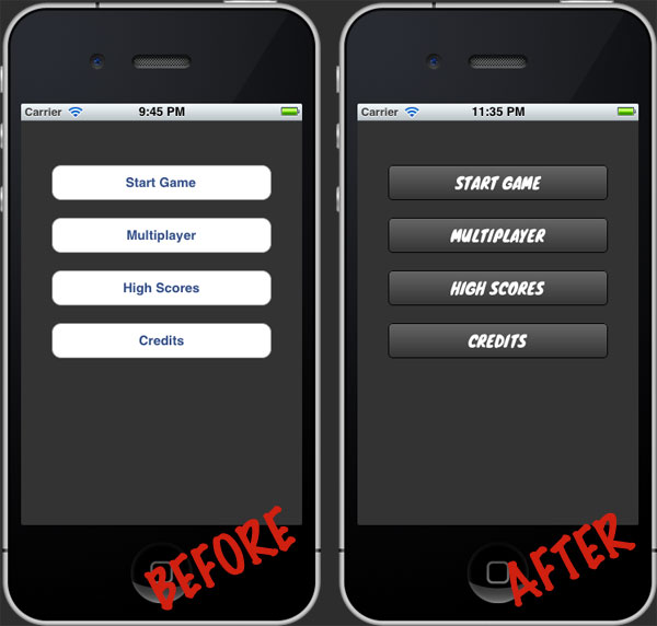
Tip #1: Tweak Colors & Gradients
The most fundamental step toward customizing the UIButton class is to adjust the color of the background and title for both the default and highlighted states. The following code snippet sets each button’s background color to black, normal title color to white, and highlighted title color to red:
|
1
2
3
4
5
6
|
// Set the button Text Color[btn setTitleColor:[UIColor whiteColor] forState:UIControlStateNormal];[btn setTitleColor:[UIColor redColor] forState:UIControlStateHighlighted]; // Set the button Background Color[btn setBackgroundColor:[UIColor blackColor]]; |
Solid background colors are great, but a subtle gradient can often make the difference between bland and polished. Replace the setBackgroundColor: message above with the following to create a custom gradient:
|
1
2
3
4
5
6
7
8
|
// Draw a custom gradientCAGradientLayer *btnGradient = [CAGradientLayer layer];btnGradient.frame = btn.bounds;btnGradient.colors = [NSArray arrayWithObjects:
(id)[[UIColor colorWithRed:102.0f / 255.0f green:102.0f / 255.0f blue:102.0f / 255.0f alpha:1.0f] CGColor],
(id)[[UIColor colorWithRed:51.0f / 255.0f green:51.0f / 255.0f blue:51.0f / 255.0f alpha:1.0f] CGColor],
nil];
[btn.layer insertSublayer:btnGradient atIndex:0]; |
Starting on line 4 above, an NSArray is created with the initial and target gradient colors. Note that the corresponding RGB values must be divided by 255 before being supplied to thecolorWithRed:green:blue:alpha: message and that an alpha value of 1.0 represents fully opaque while an alpha value of 0.0 represents fully transparent. Unfortunately, a full explanation of the “magic” above is beyond the scope of this tutorial, but the important thing to remember is to that you simply need to replace the RGB values with the begin/end values you want to use in your own custom gradient.
If all went well, your menu should now look something like this:
Not bad, huh? And we’ve only just begun. . .
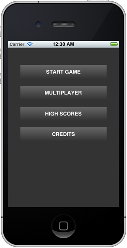
Tip #2: Round the Corners
Next we want to add a custom corner radius to each UIButton in order to make things look a bit more sleek. Insert the following lines of code to make this happen:
|
1
2
3
4
|
// Round button cornersCALayer *btnLayer = [btn layer];[btnLayer setMasksToBounds:YES];
[btnLayer setCornerRadius:5.0f]; |
In line 4 above the corner radius is set to 5.0. Play with this number to increase or decrease how noticeable the corners appear.
You should now have a menu that looks just a bit slicker:
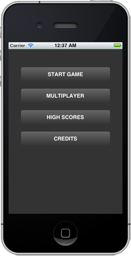
Tip #3: Add a Stroke Border
Sometimes the small tweaks make all the difference. Add a 1px, black stroke around each button with the following lines of code:
|
1
2
3
|
// Apply a 1 pixel, black border[btnLayer setBorderWidth:1.0f];[btnLayer setBorderColor:[[UIColor blackColor] CGColor]]; |
Can you tell the difference? It’s very subtle, but still valuable:

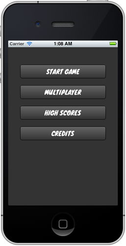
Tip #4: Use a Custom Font
Now let’s try a more noteworthy tweak. The default system font just isn’t cutting it. The game menu we’re building needs a font that can match the visual aesthetic of the game. A quick search on Google Fontsreveals just a font called Knewave by Tyler Finck that should do the trick. Download Knewave now.
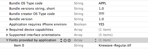
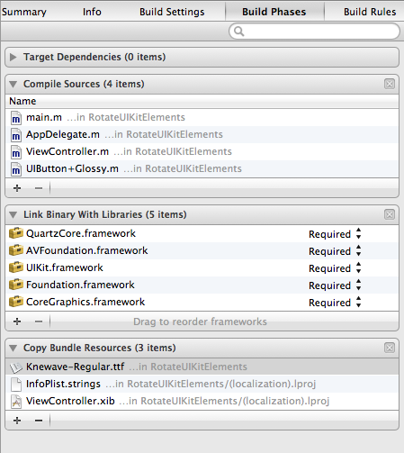
After downloading the Knewave-Regular.ttf file, you’ll need to drag it into the Project Navigator pane in Xcode to add it to your project. Next, open up the Info.plist file. Add a new property list row and type in “Fonts provided by application”. An array should be created automatically. Set the string associated with Item 0 to “Knewave-Regular.ttf”. Double check the name because the value is case sensitive. Save the file.
After making the above modification, your Info.plist file should now look like this:
Next, you’ll need to add the Knewave-Regular.ttf file to your project’s bundled resources. Select “SleekButtons” from the Project Navigator and then click the “Build Phases” tab. Expand the “Copy Bundle Resources” drop down and then click the plus sign.
At this point, you should be able to begin using the Knewave font in your project! Let’s test that out by jumping back to the ViewController.m file and modifying the viewDidLoad method to set a custom font:
|
1
2
3
4
5
6
7
8
9
10
|
// Set the button Text Color[btn setTitleColor:[UIColor whiteColor] forState:UIControlStateNormal];[btn setTitleColor:[UIColor redColor] forState:UIControlStateHighlighted]; // Add Custom Font[[btn titleLabel] setFont:[UIFont fontWithName:@"Knewave" size:18.0f]];
// Draw a custom gradientCAGradientLayer *btnGradient = [CAGradientLayer layer];btnGradient.frame = btn.bounds; |
Notice that the fontWithName value is specified as “Knewave”, not “Knewave-Regular” as you might expect. This is because there is a difference between the font’s filename and the font’s given name. You’ll need to be sure you use the given name when working with your own fonts.
With the above code in place, the game menu should be complete! Build and run now and you should see something like the following:
Tip #5: Optional: Apply a Rotation
While not utilized in the primary design demonstrated by this tutorial, it’s often useful to apply a slight rotation to UIKit elements, particularly UIButton or UIImage objects. Doing so is simple, and can be done with just one line of code.
You can try this out with the code written so far by doing the following:
|
1
2
3
4
5
6
7
|
self.startGameButton.transform = CGAffineTransformMakeRotation(M_PI / 180 * 5.0f);
for(UIButton *btn in buttons)
{ // Set the button Text Color
[btn setTitleColor:[UIColor whiteColor] forState:UIControlStateNormal];
[btn setTitleColor:[UIColor redColor] forState:UIControlStateHighlighted];
|
In line 1 above, the constant M_PI is divided by 180 to generate 1 radian, which is then multiplied by 5.0f to result in a rotation of 5 radians. As you will notice if you build and run the project, the above is likely to result in anti-aliasing problems with UIKit elements that are drawn dynamically. Consequently, applying a rotation is more appropriate with a UIButton when the background image property is set and raster graphics are in use (i.e. this works best with PNG files).
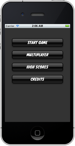
Bonus Tip: Use UIButton-Glossy
With the five tips above, you’ve seen how easy it can be to make subtle yet significant tweaks to aUIButton object. However, what if I told you that doing so could be even easier? Meet UIButton-Glossy, an open-source category by George McMullen that automatically applies both a gradient and a glossy finish to UIButton objects.
Implementing UIButton-Glossy in your own project is simple. After you’ve downloaded the UIButton-Glossy.h and UIButton-Glossy.m files and added them to your Xcode project, import the *.h file in the main project view controller, like this:
|
1
2
|
#import "ViewController.h"#import "UIButton+Glossy.h" |
Now you can instantly apply a cool glossy effect on your buttons with just one line of code: [btn makeGlossy];.
To see this in action, replace the existing view controller code with the following:
|
1
2
3
4
5
6
7
8
9
10
11
12
13
14
15
|
for(UIButton *btn in buttons)
{ // Set the button Text Color
[btn setTitleColor:[UIColor whiteColor] forState:UIControlStateNormal];
[btn setTitleColor:[UIColor redColor] forState:UIControlStateHighlighted];
// Set default backgrond color
[btn setBackgroundColor:[UIColor blackColor]];
// Add Custom Font
[[btn titleLabel] setFont:[UIFont fontWithName:@"Knewave" size:18.0f]];
// Make glossy
[btn makeGlossy];
} |
Your buttons should now have a glossy finish and the end result should look something like this:
Wrap Up
This tutorial has demonstrated multiple techniques for making custom UIButton objects shine. Download the attached project for a glimpse at the full, final source code.
(转自)http://mobile.tutsplus.com/tutorials/iphone/custom-uibutton_iphone/


发表评论

-
ios 声音合成
2013-08-18 13:20 1236http://stackoverflow.com/ques ... -
__bridge,__bridge_retained和__bridge_transfer的意思,区别与使用 20 三
2012-12-24 01:41 1642使用ARC能帮我们减轻不少内存管理方面的负担,尤其是对用 ... -
CAAnimation
2012-12-23 01:09 2303CAAnimation采用了CAMediaTi ... -
UIViewAnimation动画与Core Animation的CATransition类动画
2012-12-23 01:06 2697使用UIView类函数实现://U ... -
GCD实战2:资源竞争
2012-12-23 01:04 1553转自http://www.dreamingwish.co ... -
GCD实战一:使用串行队列实现简单的预加载
2012-12-22 17:10 2820转自 http://www.dreamingwish.c ... -
GCD介绍(四): 完结
2012-12-22 17:08 1327转自 http://www.dreamingwish.c ... -
GCD介绍(三): Dispatch Sources
2012-12-22 17:07 1599转自 http://www.dreamingwish.com/ ... -
GCD介绍(二): 多核心的性能
2012-12-22 17:05 1151转自http://www.dreamingwish.co ... -
基本概念和Dispatch Queue
2012-12-22 17:03 1317转自 http://www.dreamingwish.c ... -
Best Audio Format for iPhone Audio Programming
2012-12-19 16:26 2507I had never done audio p ... -
LAME 是一个开源的MP3解码编码工具
2012-12-19 13:09 8501MP3 Encoding * 编码MP3文件必须按如下 ... -
sqlite3中的数据类型
2012-12-10 21:37 1267(转)http://www.cnblogs.com/kfqco ... -
ios随机数,and()、random()、arc4random()
2012-11-15 11:06 4690原文:http://bj007.blog.51cto.c ... -
IPHONE GIF 播放的方式
2012-10-11 18:30 1415转 http://blog.csdn.net/zltia ... -
在新线程中使用NSTimer
2012-10-11 18:21 1552转自 http://blog.csdn.net/sjzs ... -
Creating an iPhone Daemon – Part 5
2012-09-02 15:29 1508Creating an iPhone Daemon – ... -
Creating an iPhone Daemon – Part 4
2012-09-02 15:28 1379Creating an iPhone Daemon – ... -
Creating an iPhone Daemon – Part 3
2012-09-02 15:25 1477This is part three of the bl ... -
Creating an iPhone Daemon – Part 2
2012-09-02 15:24 1222Here is part two of the blog ...
相关推荐
设置chrome浏览器访问过的链接颜色改变
Stylish优质样式备份,包含百度搜索优化,百度暗色主题,Google暗色主题,全局暗色主题
Chrome插件Stylish(你的Chrome与众不同)
Chrome浏览器的stylish插件,可以用来管理样式。 此处提供的是从网上下载的插件,可以得到.xpi格式的文件,Chrome或Firefox浏览器都支持这中扩展程序,可以在浏览器的扩展程序中加载、添加安装。
firefox专用stylish.xpi
iOS 10 SDK Development: Creating iPhone and iPad Apps with Swift by Chris Adamson English | 24 Mar. 2017 | ASIN: B071RRCK9R | 264 Pages | AZW3 | 5.24 MB All in on Swift! iOS 10 and Xcode 8 make it ...
我在chrome上使用完全支持,而且效果很好,理论上只要浏览器支持stylish那么就有效果。
stylish-haskell, Haskell代码 prettifier 时尚 haskell 简介简单的Haskell代码 prettifier 。 目标不是格式化文件中的所有代码,因为我发现这类工具经常是"别挡着路"。 然而,手动清理导入语句 等等 很快就会变得...
Stylish是这样一个Firefox扩展,你可以利用它来定制目标网页或网站的css样式,甚至一些Firefox app的样式,让浏览效果更加舒适。而且在UserStyles网站上已经有不少现成的样式可供下载,让不会写css的普通用户也可以...
前端项目-startbootstrap-stylish-portfolio,由Start Bootstrap创建的时尚单页引导组合主题
由于chrome浏览器的google商店需要,对于一些常用的扩展工具可能难以下载到,分享一个下载的比较好的样式管理工具,优化一下自己的开发工具吧~
creating for Android is somehow extraordinarily rewarding. Defining exactly why this is so is quite difficult. Perhaps it is the fact that the platform is free and open. You can distribute your apps ...
利用用户样式管理器Stylish来重新编辑网站的样式。您可利用Stylish为许多网站安装主题和皮肤,也可创建自己的主题和皮肤。 ★ 为Reddit添加黑色风格,使用简约的Facebook,或者更改Google、Twitter或您最爱的任意...
NULL 博文链接:https://lujinan858.iteye.com/blog/2180108
Covering the bulk of what you need to know to develop full-featured applications for OS X, this edition is updated for OS X Yosemite (10.10), Xcode 6, and Swift. Written in an engaging tutorial style ...
您也可以使用包管理器进行安装: Debian 9或更高版本: apt-get install stylish-haskell Ubuntu 16.10或更高版本: apt-get install stylish-haskell Arch Linux: pacman -S stylish-haskell特征对齐和排序import...
Firefox Stylish插件样式表备份
CALCU™ Stylish Calculator 中文版CALCU™ Stylish Calculator 中文版 CALCU™ Stylish Calculator 特色 ★尝试我们新的Material主题! ★美观,直观的界面,基于手势的控制和导航 ★输入时查看计算的即时结果 ★在...
If you’re developing applications for Mac OS X, Cocoa® Programming for Mac® OS X, Fourth Edition, is the book you’ve been waiting to get your hands on. If you’re new to the Mac environment, it’s...